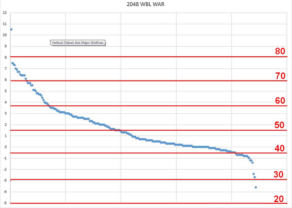
Below I've pasted an image showing a slightly incomplete WAR analysis for the 2048 WBL. Overlayed on top of the data are data bands representing the Mean (Roughly 1.5 WAR) and bands representing 3 standard deviations in either direction from the mean. For those of you familiar with how the 20-80 scale works, each 10 points away from 50 is supposed to represent one standard deviation away from the average player.
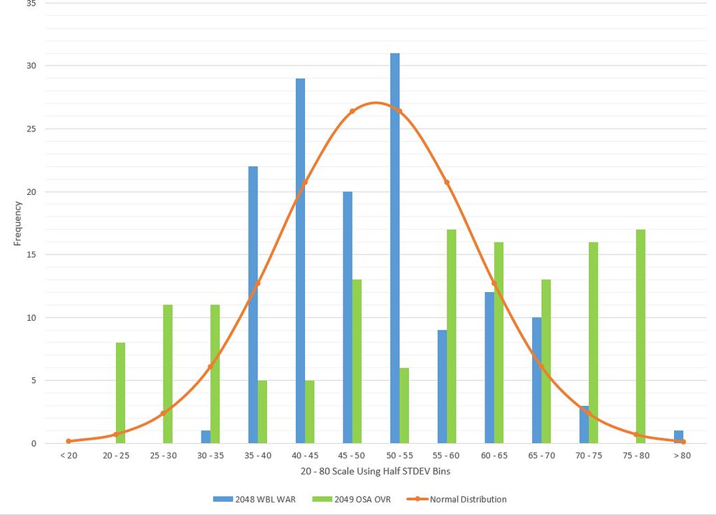
Typically we find in that a normal distribution fit is a pretty good representation of this type of sports data. In a normal distribution you will have 68% of the data points within the 40-60 range. About 95% of the data will lie between the 30 and 70 range and 98% will lie within the 20-80 bands.
In order to see how well the actual data fits with the normal distribution, you have to conduct what is called a frequency analysis by making a histogram based on these "bins" (I usually prefer bins of half standard deviations to be able to visualize a bit better) and then overlaying the ideal normal distribution curve over the top of those histograms. I had this done last night, but EXCEL crashed on me so for now you'll just have to visually estimate how much data lies between each set of bands.
In our case I think a normal distribution fits pretty well. We have 220 total entries and most of our data should be located between the 40 and 60 bands, and that definitely looks to be the case. The 40-50 "bin" looks to have more frequency than 50-60 "bin" to me.
Now 95% of our data is supposed to also be between the 30 and 70 bands. This is where you can see our distribution is obviously skewed as we have about 20-25 entries above the 70 band and only one entry below the 30 band. Still, we are relatively close as I'd say about 90% of the data lies between the 30 and 70 bands (20-25 points out of 220 are outside). Still a pretty good fit compared to a normal distribution.
A normal distribution would predict roughly 98% of the data being between the 20 and 80 bands. In our case, we only have one entry outside (Carrier) so 99.5% of the data fits between 20 and 80. Still a normal distribution is a good fit.
I'll do a more thorough frequency analysis later, but my conclusion is that a normal distribution is a good approximation for our player population. We appear to have a slight over-representation in the 40-50 and 70-80 range and slight under representation in the 20-30 range. This means we've got more slightly below average players in the league and more all star type players in the league than would be predicted by a normal distribution.
Still, you can see how the OOTP "Overall" ratings fail to describe this population. Based on performance which is pretty well described by a normal distribution, the vast majority of players should have "Overall" ratings in the 2-3 star range (roughly the 40-60 range) while about 90% of the players in our case should have ratings in the 1-4 star range (roughly 30-70). We should have slight over representation in the 4-5 star range and under representation in the 0-1 star range. If you look at OOTP overall ratings for our player population you'll find a ton of 0.5 and 1 star rated players that perform much close to the league average than their hamfisted fuckshit "overall" STARRZZZZ would suggest. As such, I would pretty much ignore the STARRZZZZ rating as a predictor of player performance. Your 1 star guys could very well be average players to even above average players.
So @OU11, this is what I'm tombout when I'm mad that the OOTP ratings don't reflect a normal distribution. I'm not trying to "force" the players into a distribution of my choosing, it is clear that the statistical data supports a normal distribution for our population pretty damn well. I'll Show you the OOTP "Overall" rating distribution as a comparison and you can see it looks nothing like the distribution of the actual WAR statistics, which is why I view OOTP's "Overall" rating as largely worthless (regardless of whether we display it as STARZZZ or 20-80 scale).